
There is an option to nest narratives in these objects. At the same time there is option to nest objects in stories and tell the story around these objects.
Storytelling (based on the article I received from Simone).
When we see bulletpoints on a slide show than a certain part of our brains is activated: The one which turns words into meanings. It is the Brocos area and the so called Wernickes area. And that’s it.
Whenever we hear a story however al parts of our brain will be activated. Also those which usually are only activated when we experience a story.
So basically this means brains can synchronize when people tell a story.
Evolution has weired our brain to work this way.
Recent research has shown that this is to an extend explainable with the discovery of so called mirror neurons.
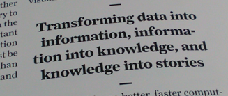
In a way we can say visualizing data and putting them in a a context is the human face of big and extremely complex data.
Storyboarding
The visual flow of a narrative is a relatively new concept, but visual storytelling is not. Already cavement use this technique, drawings on walls communicated without motion.
While movies and pictures are linear forms of storytelling, multimedia applications and interactive visualisations are not. A user interacts with the message communicated. And so I can refer to Manuel Lima at this point who worked out the three steps on a way to storytelling with visual data.
Storytelling for Interactive Visualisations
In his introduction Andrew Losowksy states that storytelling is always related to the first visual impression. In Interactive Storytelling however it is not only beauty which engages but alos the interaction as such which can be perceived as beautiful or disrupting. Beautiful Interactions, Motions, animations, contribute tremendeously to successful storytelling.
The visualization is not as important as the story. A story works without and independent from the medium.
As already indicated at the beginning of this chapter, Communication is just one side of data visualization. On the one hand there is exploration. The viewer of visualizations can himself be explorative and discover data sets and he should be supported in his cognitive abilities to discover pattern in data.
One example for this is the classical film Finder (IMG 9) created by Ben Shneiderman. This example may appear ugly from a today’s perspective, but it was one of the first professional visualization tools which included a timeline. It was created as a tool for experts.
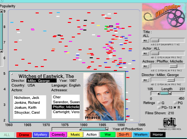
IMG 9: Created by Ben Shneiderman
Later designers started investigating in this field and started creating similar but aesthetic tools, like the Newsmap (IMG 10).
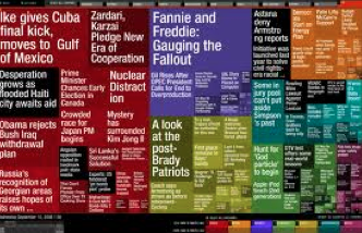
IMG 10: Newsmap on www.newsmap.jp
Nowadays there are many attempts how visualizations can be used so that
non-experts can visualize data. ‘Many eyes’ [MA6] was a pioneer in this field.
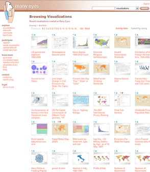
IMG 11: Many eyes, created to visualize
data sets on your own as a non expert
or nowadays an application like infogram (IMG 12):
IMG 12: Similar to many eyes, yet more
consumer-oriented
Another very well known example for good data visualization in explorative environments is represented by “Gapminder”.
Gapminder became very famous through a Ted talk as Hans Rosling managed to tell stories with his data by animating and framing them in a certain context. He presents data “With the drama and urgency of a sportscaster” ( Rosling, 2007)
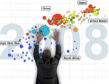
IMG 13: Hans Rosling tells stories with interactive visualisations
Storytelling seems to be a very effective and efficient way to communicate data.
Widrich elaborates in his article how our brain reacts to stories ( Widrich, 2012).
He gives the example of what happens to our brain if we see a list of bulletpoints: The part of our brain is activated which turns word into meanings, and that’s it!
However, if we listen to a story, so Widrich, the same parts in our brain become active as if we were experienced the story ourselves. So in a way, as he says, we can synchronize our brains.
Recent research has shown that this effect might be based on the so-called mirror neurons ( Mirror Neurons, Wikipedia, 2013). Mirror neurons allow a deeply rooted physio-biological process that can even be observed with babies and some animals (see IMG 14). It allows us to produce similar feelings and reactions when being confronted with certain perceptual stimuli.
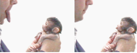
IMG 14: A baby monkey seems to react to a human. Recent research has shown that this might not be a reaction but an imitation as mirror neurons provoke a certain cognition in the monkey brain.
In a way we can say that visualizing data and putting them in the context of a story allows us to create a human face of big and complex data.
Storytelling, as Tumminello elaborates (Tumminello, 2005: p. 2), so the visual flow of a narrative, is a relatively new concept but visual storytelling as such is not. Cavemen in the Stone Age had already used this technique, only with drawings on walls and without any motion or text. While movies and pictures are linear, interactive data visualizations are not. As a user interacts with a story he gets involved and becomes part of it. For this reason a good Interactive Information Visualization does not only provide visually appropriate and aesthetic design, clear data structures but also a superb Interaction Design. The beauty and aesthetics of Interaction Design as described by Jonas Löwgren (Löwgren, 2007: p.70) is a key aspect in Story telling with data visualizations.
So the combination of a story with clean design on both a visual and interaction design level, can be considered as a major aspect of storytelling.
***
After I identified aspects of truth and sensemaking as a part of storytelling I was able to contextualise my research further. I understood that if you want to make sense out of BIG data you have to find a way to make sense out of these data for someone. Storytelling is a powerful way.
But Sensemaking with storytelling also has a downside which I want to explain later on.
Before this I want to come back to the data I analysed. I understood how difficult it is to find usable and less semi-structured data sets to work with. As I am not preparing a technological work I decided to use data about my own behavior instead of a whole city etc…. And even this turned out to be incredibly difficult.
I already see a democracy problem in just trying to get these data: I simply couldn`t access them. Companies know more about our digital identity than we do. They can predict behavior of these for an individual and a person better then a person her or himself.
So after I understood this I decided that it might also be interesting to at least have a look at publicly available data about myself. The so called public persona. But also here I did have a hard time.
We can understand our public persona as a set of stories to be discovered with storytelling. This made me having a look at storytelling techniques for big and complex data sets and I stumpled upon a research paper from the Stanford university. It describes storytelling techniques for Data Visualisations.
Visual Data stories: Human Face of Big Data
Collecting visualisations with narrative components and than attempt to identify and categorize the design features that effectively tell stories with data.
- Primary source: Online Jorunalism, including visualisations produced by the New York Times, the Guardian, the Financial Times, the Washington post and Slate: Analysiere die Narratives und interaktiven Geräte, die in den Beispielen genutzt weren. Die akkumulierten Daten ergeben wiederkehrende Muster, die zu einer Analyse führen.
Mapping data and still telling stories
There are not many people who have written a lot about data visualization and storytelling.
While a story is usually linear, it becomes branched in digital, interactive stories.
Doing an intensive research which extracts patterns and applies them to a design example of mapped data.