
This article was written in Feb 2013. I never completed it but it was an important milestone in my concept development phase. It partially found its way in my final report.
Big and complex data sets are far too complicated to be analysed by average humans.
Special analysts with special tools are required .Exploring big data and making sense of it is becoming a key competence. But even after machines analysed data and trained analysts to understand it; the data still need to be communicated to a wider audience. We, the people who generate big data sets, should understand these data and it is the task of Designers to find appropriate yet still aesthetic ways of displaying these data in strong collaboration with experts. A data designer’s task is to make use of graphical metaphors to display abstract data sets and to present data in a way which illustrates inherent patterns and structures to allow us to make sense out of these big data. My research has shown that this can also create an ethical problem. It is impressive to see how aesthetic pictures create a certain perception and award a certain authority to the visualization of data.
A good example can be seen in the friendship map. This map shows friendship connections on Facebook around the world. What fascinates most of us in this picture is the strong visual impression it provides.
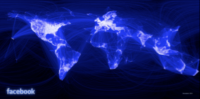
http://www.gizmodo.de/wp-content/uploads/2010/12/facebook-friendship-map.jpg
Now, if we compare this image with the War room in Kubricks movie Dr. Strangelove then we can see a
pretty similar graphic in the background and understand what an impact this graphic has.

http://onepuzzledspecies.files.wordpress.com/2013/03/warroom.jpg
In this impact lies however a big danger which becomes apparent when we look at another well known example: The world map.
In Europe we all know and grew up with the map as displayed below.
We assume that the display of the map conveys a true and objective image of the world.
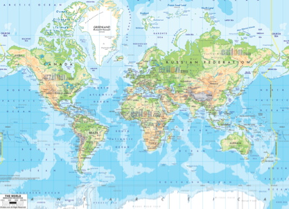
The world from a European perspective
But there is a way to look at this map from a completely different perspective. One of them is shown below, an equally valid model of the world.
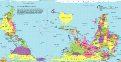
Hobo dyer – presentation of the world
If we are looking at this representation than it becomes apparent that behind every visualization there is an idea and a very specific perspective which always can and mostly should critically be questioned. But sometimes this is not possible as our brain is wired in a way to make conclusions fast. So-called unconscious conclusions, a pre-rational mechanism in visual perception which according to Frey ( Frey, 2010, referenced on Wikipedia) follows its own and unchangeable rules. Frey describes the sun as a very vivid example for this phenomenon. When we see the sun rising and setting we would never believe that we fly around an empty space on an old huge rock circling around a radioactive fire ball. Yet we know it and still can hardly believe it as the image is extremely strong and we are sure that the sun is circulating around the earth. The reason for this lies in a neurophysical aspect of how our brain processes visual information, which does not involve the centers in our brain which are responsible for conscious information processing. Explaining this issue would again exceed the scope of this work and I refer to the book of Sigfried Frey: “Die Macht des Bildes”. Even though these cognitive processes play a big role in information visualization. But in this work I want to focus in this work on its implementation in Storytelling for Interaction and Visual Design and not on the basic ground research.
An example for a powerful and useful information visualization is provided in the famous example displayed in IMG 7. John Snow mapped where people died of cholera in London’s Soho and he found out that a water fountain was contaminated with Cholera as many people died in this area. By closing this fountain, the epidemic ended.
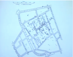
IMG 7: Cholera map by John Snow, London, Soho, 1854
Another good and mentionable example is provided by Otto Neurath (IMG 8)
He managed with very simple implementations of selected data sets to communicate certain statements.
Simple communication of data sets by Otto Neurath
As already indicated at the beginning of this chapter, Communication is just one side of data visualization. The other side is data exploration. The viewer of visualizations can himself be explorative and discover data sets and he should be supported in his cognitive abilities to discover inherent pattern in data.
One example for this is the classical film Finder created by Ben Shneiderman. This example may appear ugly from a today’s perspective, but it was one of the first professional visualization tools which included a timeline. It was created as a tool for experts.
Created by Ben Shneiderman
Later designers started investigating in this field and started creating similar but aesthetic tools, like the Newsmap
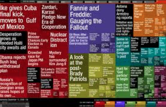
Newsmap on www.newsmap.jp
Nowadays there are many attempts how visualizations can be used so that
non-experts can visualize data. ‘Many eyes’ [MA6] was a pioneer in this field.
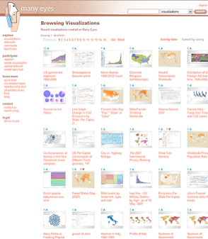
Many eyes, created to visualize
data sets on your own as a non expert
or nowadays an application like infogram
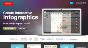
Similar to many eyes, yet more
consumer-oriented
Another very well known example for good data visualization in explorative environments is represented by “Gapminder”.
Gapminder became very famous through a Ted talk as Hans Rosling managed to tell stories with his data by animating and framing them in a certain context. He presents data “With the drama and urgency of a sportscaster” ( Rosling, 2007)
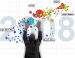
Hans Rosling tells stories with interactive visualisations
Storytelling seems to be a very effective and efficient way to communicate data.
Widrich elaborates in his article how our brain reacts to stories ( Widrich, 2012).
He gives the example of what happens to our brain if we see a list of bulletpoints: The part of our brain is activated which turns word into meanings, and that’s it!
However, if we listen to a story, so Widrich, the same parts in our brain become active as if we were experienced the story ourselves. So in a way, as he says, we can synchronize our brains.
Recent research has shown that this effect might be based on the so-called mirror neurons ( Mirror Neurons, Wikipedia, 2013). Mirror neurons allow a deeply rooted physio-biological process that can even be observed with babies and some animals. It allows us to produce similar feelings and reactions when being confronted with certain perceptual stimuli.
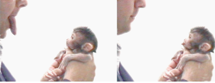
A baby monkey seems to react to a human. Recent research has shown that this might not be a reaction but an imitation as mirror neurons provoke a certain cognition in the monkey brain.
In a way we can say that visualizing data and putting them in the context of a story allows us to create a human face of big and complex data.
Storytelling, as Tumminello elaborates (Tumminello, 2005: p. 2), so the visual flow of a narrative, is a relatively new concept but visual storytelling as such is not. Cavemen in the Stone Age had already used this technique, only with drawings on walls and without any motion or text. While movies and pictures are linear, interactive data visualizations are not. As a user interacts with a story he gets involved and becomes part of it. For this reason a good Interactive Information Visualization does not only provide visually appropriate and aesthetic design, clear data structures but also a superb Interaction Design. The beauty and aesthetics of Interaction Design as described by Jonas Löwgren (Löwgren, 2007: p.70) is a key aspect in Story telling with data visualizations.
So the combination of a story with clean design on both a visual and interaction design level, can be considered as a major aspect of storytelling.
In the end however we can say the design of the medium is not central in this aspect. A good story works without and independently from the medium. It therefore might be worth looking at classical techniques of storytelling in Film, Theater and Literature. The three story act is for example a way of how a story can be structured.
I believe for this project it is worthwhile to elaborate on these classical techniques in order to translate them in animated, interactive and modern Interfaces for Big Data. Creating Human Faces for Big Data sets in order to make them accessible and to contribute to a more democratic society.
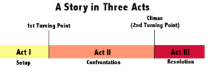
Three story act.
Evaluation
This article was written at the beginning of my project. My views on it have changed during the months I worked on it. I tried to involve the user a bit more in the sensemaking/ storytelling process in the end. Yet I realized that the designer can not be refliefed from these aspects of responsabilty as even if the user gets involved, it is still the designer who defines how (at least when it comes to Design for Digital Media/ Interactive Visualisations).
References
A big part of this article and all its referneces went into my report where all references are listed properly